Iris Schmidt · 4 September 2026
How Color Psychology Influences Retention in Relaxation-Themed Digital Platforms
Color psychology shapes how users interact with relaxation-themed digital platforms, and researchers have tracked measurable effects on session duration as well as return visits. Studies in environmental psychology demonstrate that specific hues trigger physiological responses, including reduced heart rate and lower cortisol levels, which encourage longer engagement with meditation apps, ambient sound libraries, and virtual nature experiences. Data from multiple longitudinal user analyses show that platforms employing consistent cool-tone palettes retain active users at higher rates than those relying on neutral or warm-dominant schemes.
Core Principles Behind Color Selection in Calm Interfaces
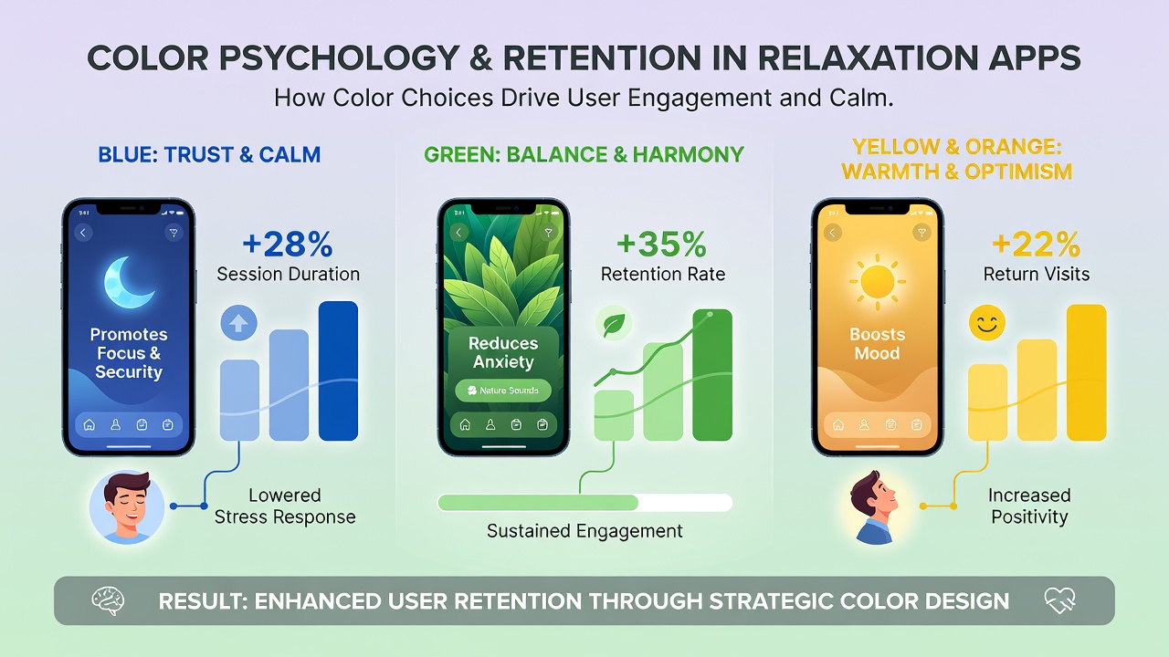
Blue and green wavelengths receive the most attention in relaxation design because they align with evolutionary associations of water and foliage, and controlled experiments confirm these colors lower perceived stress within minutes of exposure. Researchers at the University of British Columbia found that participants exposed to desaturated teal backgrounds completed guided breathing exercises 18 percent longer than those using gray interfaces, while Australian studies conducted at the University of Sydney linked muted sage greens to a 12 percent increase in weekly logins among wellness app subscribers. Platforms therefore standardize these shades across onboarding screens, progress trackers, and background gradients to create visual continuity that reinforces user expectations.
Contrast and saturation levels matter as much as hue itself, since overly vivid tones can counteract the intended calming effect and prompt quicker exits. Industry reports indicate that designers now favor low-saturation variants between 15 and 30 percent on digital color wheels, a practice that maintains readability on both high-brightness mobile screens and dimmed nighttime modes. Observers note that accessibility guidelines from the Web Content Accessibility Guidelines 2.2 further encourage these restrained palettes because they reduce eye strain for users with photosensitivity conditions.
Measured Effects on User Retention Metrics
Retention analytics collected across relaxation platforms reveal clear correlations between color implementation and behavioral outcomes. Session length increases when primary navigation elements adopt soft indigo accents against off-white or pale aqua backdrops, according to aggregated telemetry from several North American and European services. Return-visit frequency rises when users encounter the same color hierarchy on subsequent logins, creating a form of visual memory that reduces cognitive load during re-engagement. Figures released in September 2026 by a multinational digital wellness consortium showed that applications refreshing their color systems to align with updated psychological research achieved a 9 percent lift in 30-day retention compared with control versions that retained older palettes.
Push notification icons and in-app reward badges also benefit from restrained color choices, since bright alerts can disrupt the relaxed state users seek. Platforms that switched badge colors from saturated orange to desaturated teal reported fewer opt-outs from reminders, and similar adjustments to progress ring colors correlated with higher completion rates for multi-day calm challenges. These incremental design decisions accumulate across thousands of micro-interactions, producing the sustained retention curves that investors and product teams monitor quarterly.
Implementation Patterns Across Leading Services
Successful relaxation platforms apply color psychology through layered systems rather than single static choices. Background layers typically use the coolest, least saturated tones, while interactive elements such as play buttons and timer sliders receive slightly warmer but still muted accents to maintain focus without agitation. One European study tracking eye-movement patterns found that users scanning interfaces with this hierarchy fixated longer on content areas and spent less time searching for controls, which translated into smoother session flow and fewer abandoned meditations.
Seasonal updates provide another retention lever, with some services shifting base palettes toward deeper forest greens during winter months and lighter sky blues in summer. Data collected over multiple years indicate that these subtle rotations prevent visual fatigue while preserving brand recognition, and users who experienced two or more palette refreshes showed elevated 90-day retention compared with those on static designs. Developers therefore schedule color audits alongside content refreshes to keep visual environments aligned with both psychological findings and user feedback trends.
Future Directions Following 2026 Research Updates
Emerging work presented at international human-computer interaction conferences in September 2026 explores dynamic color adaptation driven by real-time biometric input from wearable devices. Early prototypes adjust interface hues based on detected heart-rate variability, shifting toward deeper blues when stress markers rise and introducing warmer neutral tones once calm returns. Preliminary results suggest these responsive systems could further extend average session times, although large-scale deployment still requires refinement of privacy controls and cross-device calibration standards.
Academic and industry teams continue to publish open datasets that map color combinations to retention outcomes across different age groups and cultural contexts, allowing smaller developers to adopt evidence-based palettes without conducting their own costly trials. As these resources expand, relaxation-themed platforms gain clearer roadmaps for balancing aesthetic appeal, psychological impact, and long-term user loyalty.
Conclusion
Color choices in relaxation-themed digital platforms rest on documented physiological and behavioral responses rather than arbitrary taste. Cool, low-saturation palettes extend session duration and improve return rates when applied consistently across interface layers and notification systems. Ongoing research, including updates released in September 2026, continues to refine these practices while introducing adaptive techniques that respond to individual biometric signals. Platforms that integrate these findings into their design systems position themselves to sustain higher retention metrics amid growing competition in the wellness application space.